6 weeks
Figma, HTML, CSS, Javascript, Bootstrap
Research, User Testing & Interviews, UX Design, Prototyping, Front-End Coding
Alison Hu, Michael Maddalon
6 weeks
Figma, HTML, CSS, Javascript, Bootstrap
Research, User Testing & Interviews, UX Design, Prototyping, Front-End Coding
Alison Hu, Michael Maddalon
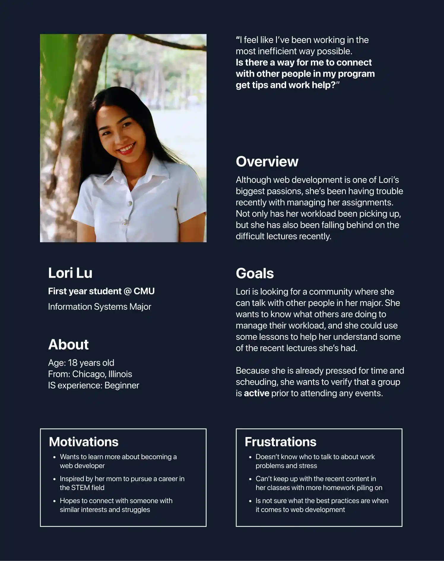
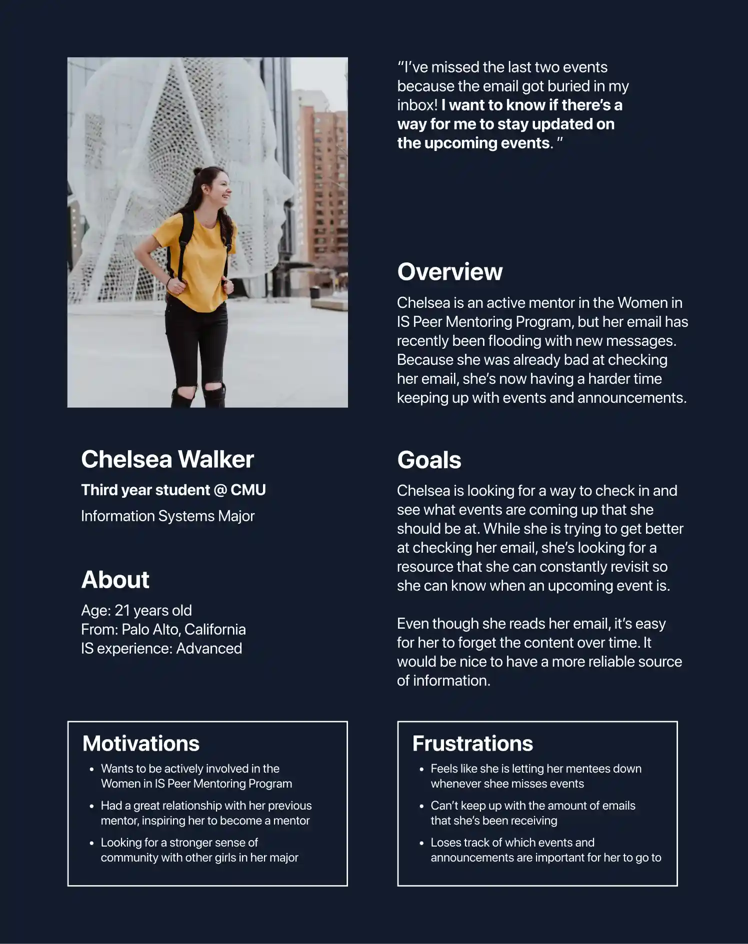
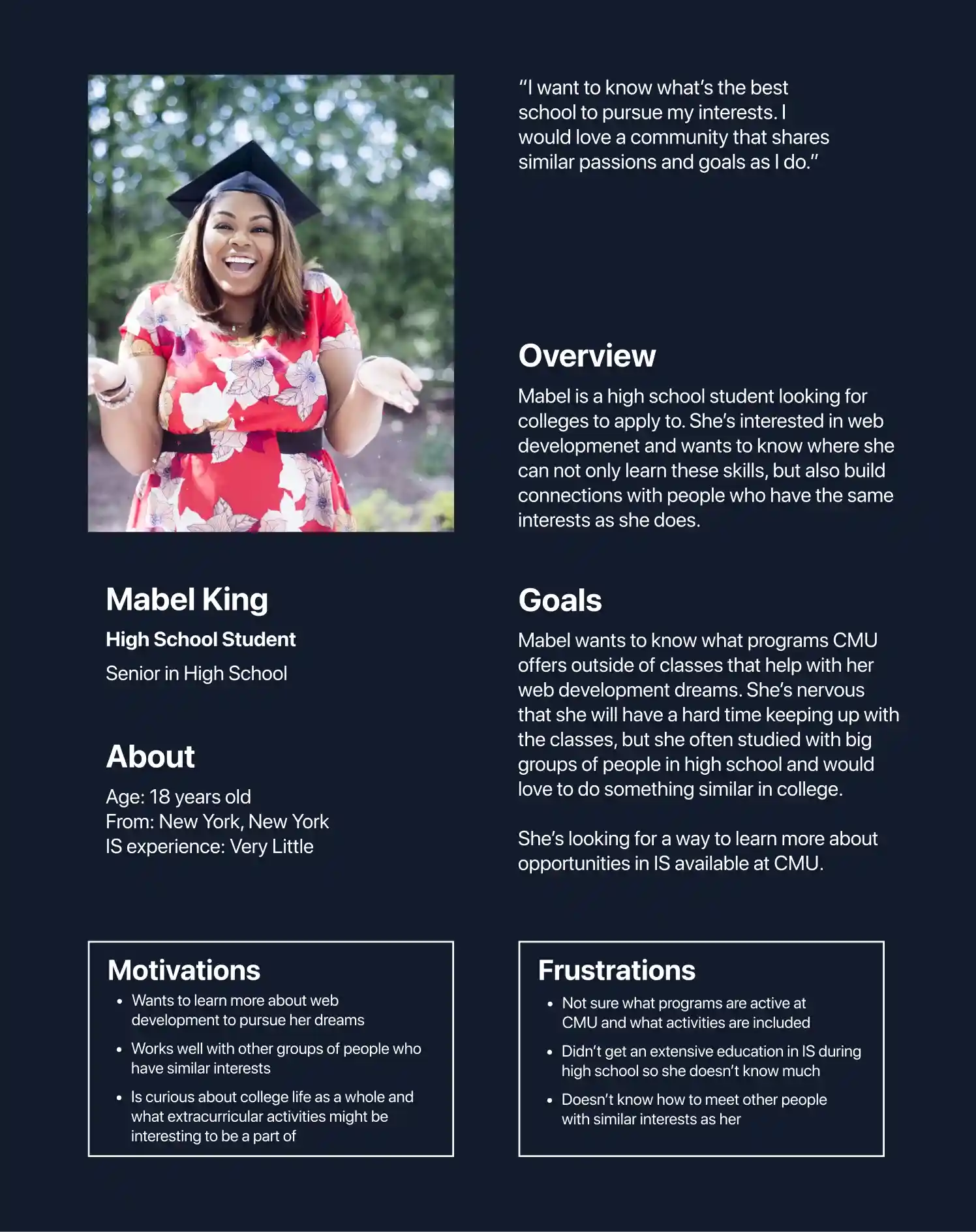
As a peer mentorship program contained within a close-knit major, the Women in IS organization has the potential to showcase their unique members and impact in the community. However, the current site does not convey the sense of community or character that exists within Women in IS.
While the program includes a variety of events throughout the year and a large group of mentors and mentees, the existing website only provides a general overview with limited information. Interested students who are seeking ways to become involved or learn more about the program face challenges in finding updated information on how to get involved.
Current mentors and mentees rely on emails for upcoming events and updates, but these can often be lost or difficult to manage. The website would serve as a more effective, consolidated platform for current members to refer to for updated information.
Redesigning the current website of Women in IS to better inform its audiences of its programs and events while reflecting the community & support within the organization.
Improving the information architecture and visual design of the website with user-focused processes including developing user personas & conducting user interviews to test solutions.
Because the Women in IS Peer Mentoring Program site is primarily accessed by web, we prioritized developing initial designs for larger desktop screens as most users would be browsing on a laptop or computer.
However, it was important for our site to be responsive, adaptable, and easy to understand at all screen sizes, and we took care that this would be true in our coded implementation.
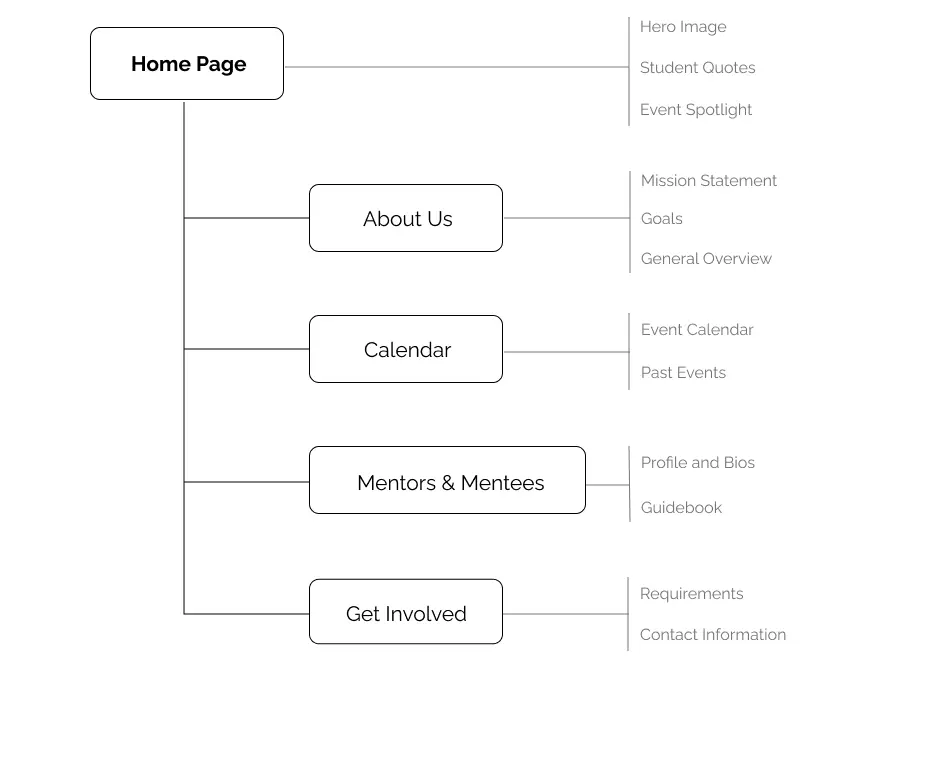
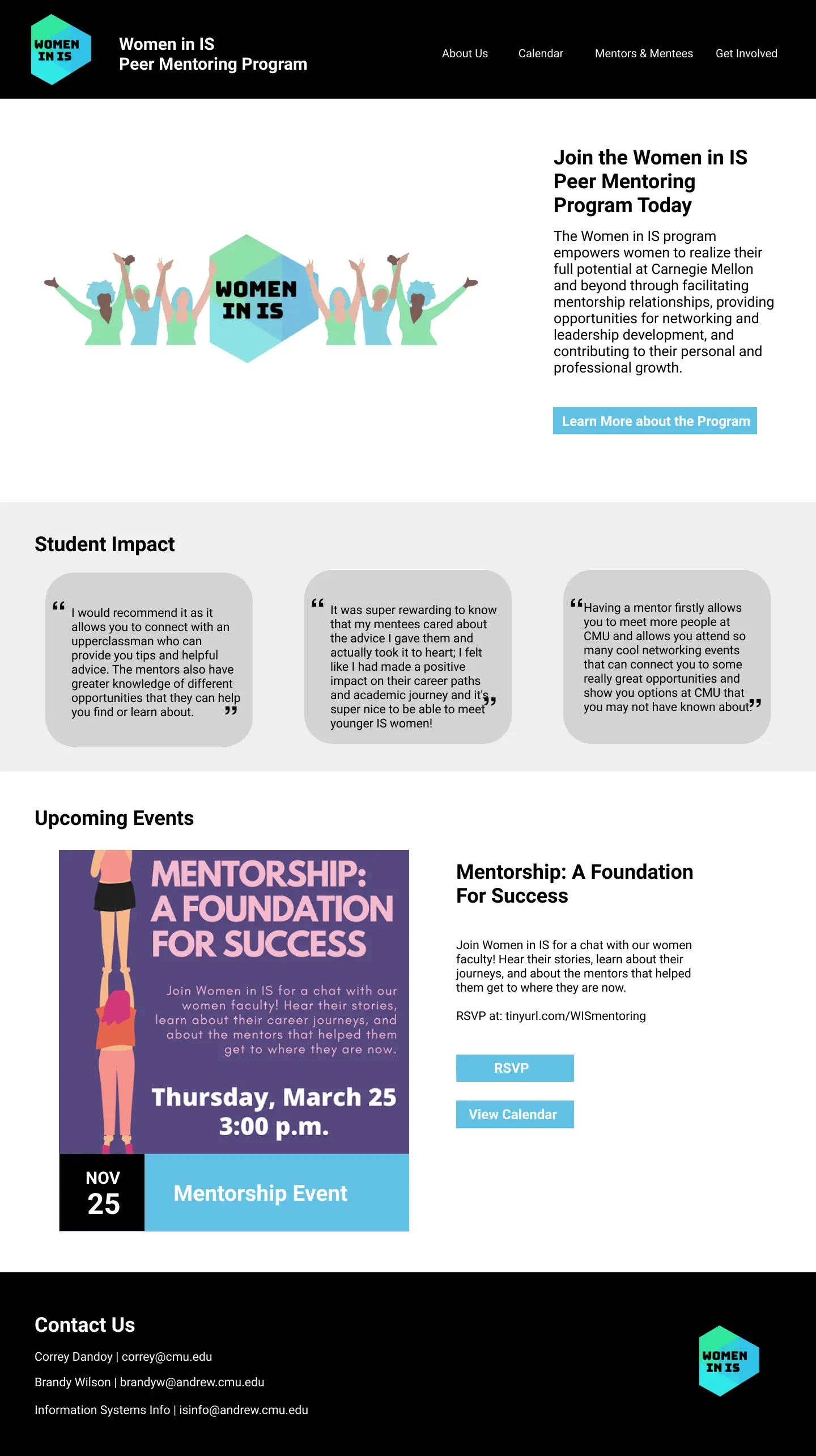
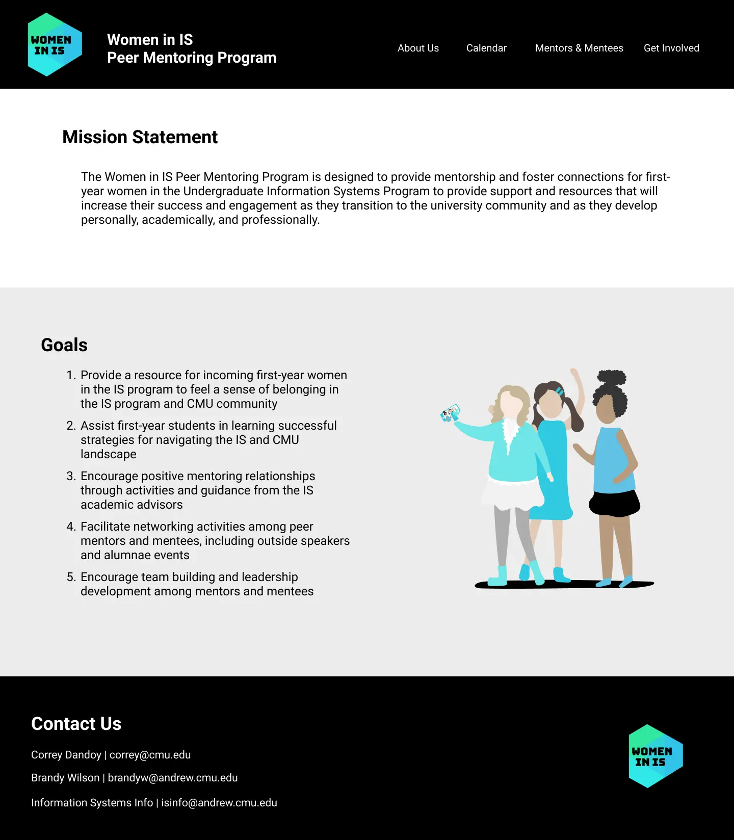
Home
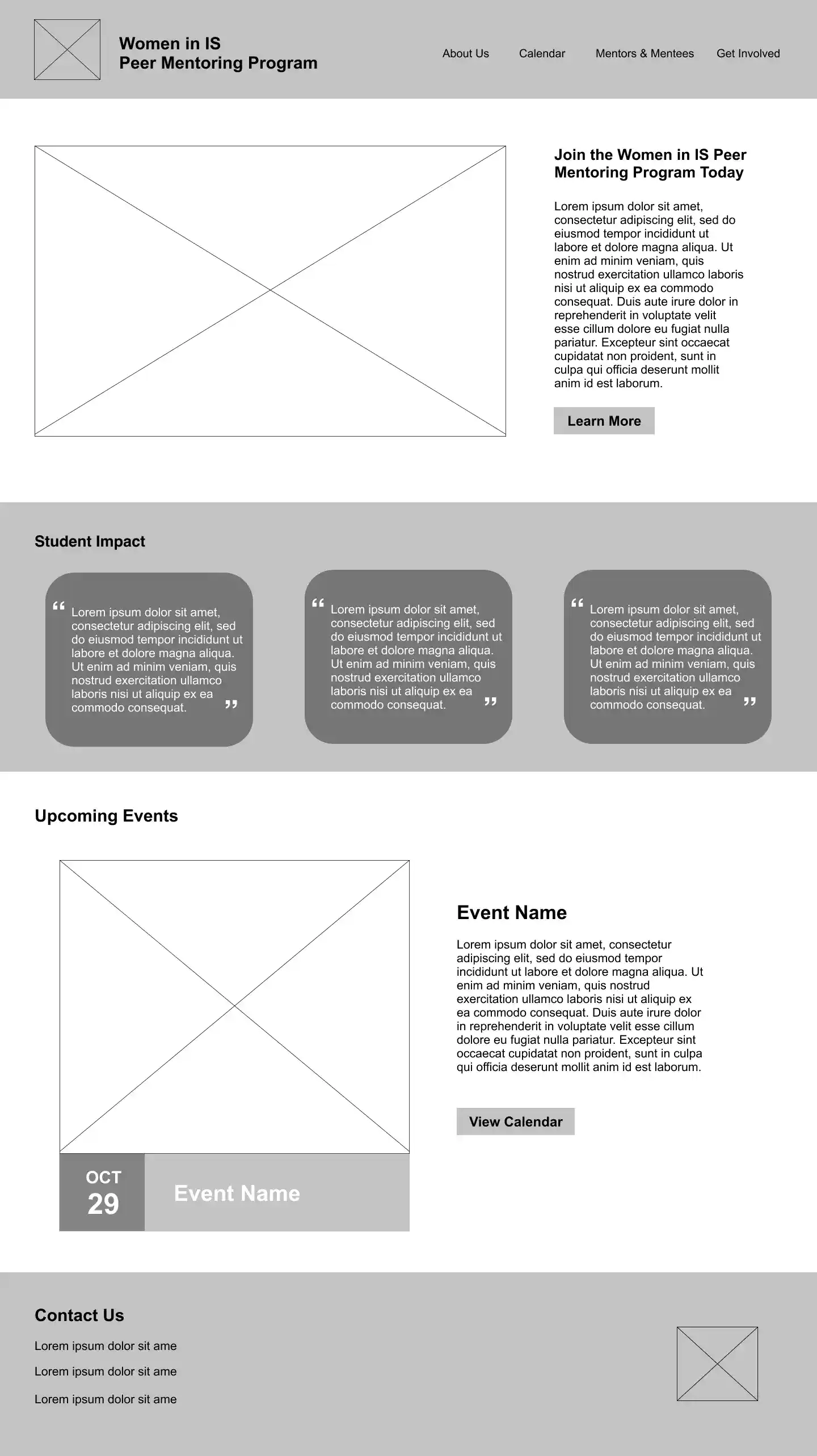
About
Calendar
Mentors & Mentees
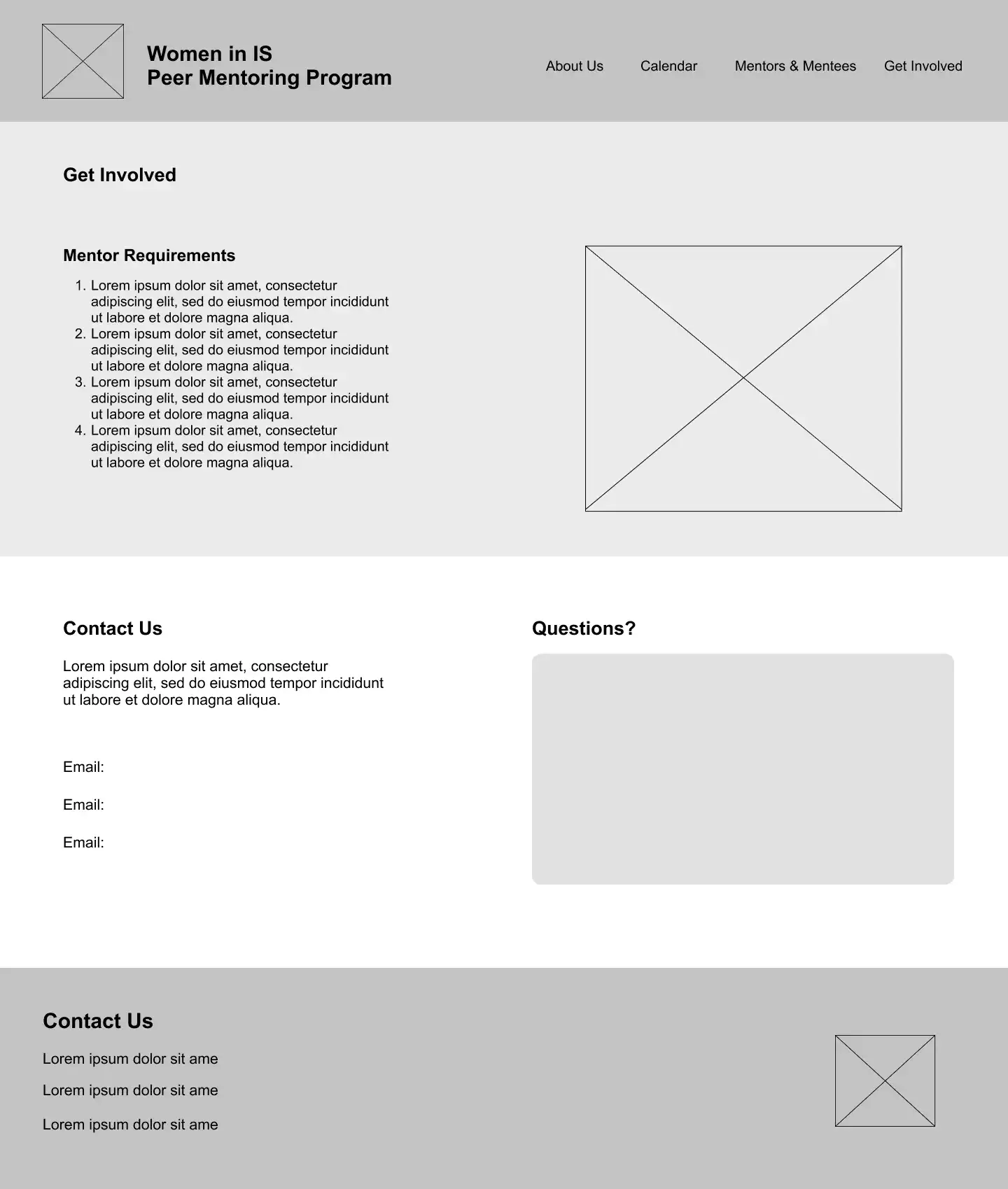
Get Involved
We tested our intitial lo-fi wireframes with 3 users (current mentor, current mentee, prospective IS student/mentee) with a speak-aloud protocol using both open-ended general behavior questions and specific goal/task-based scenarios.
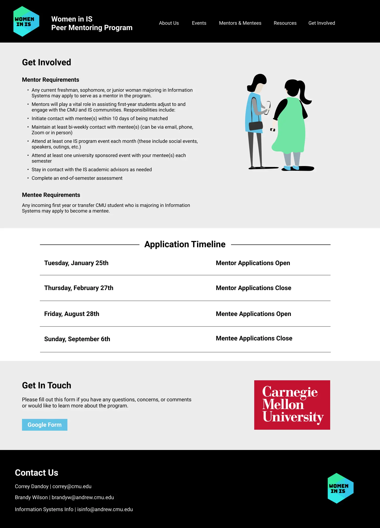
Users found the Contact Us section on the Get Involved page redundant with the same contact info inside the footer
See Solution
Replace Contact Us with a Get in Touch section with a button linking to a Google form where users can submit questions & comments
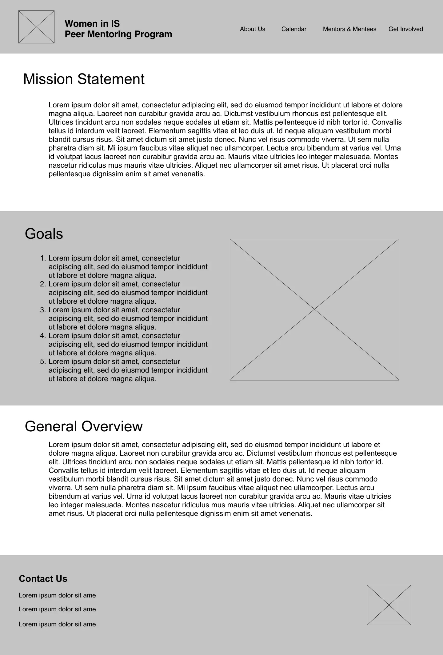
Users were unsure of the difference between the mission statement and general overview
See Solution
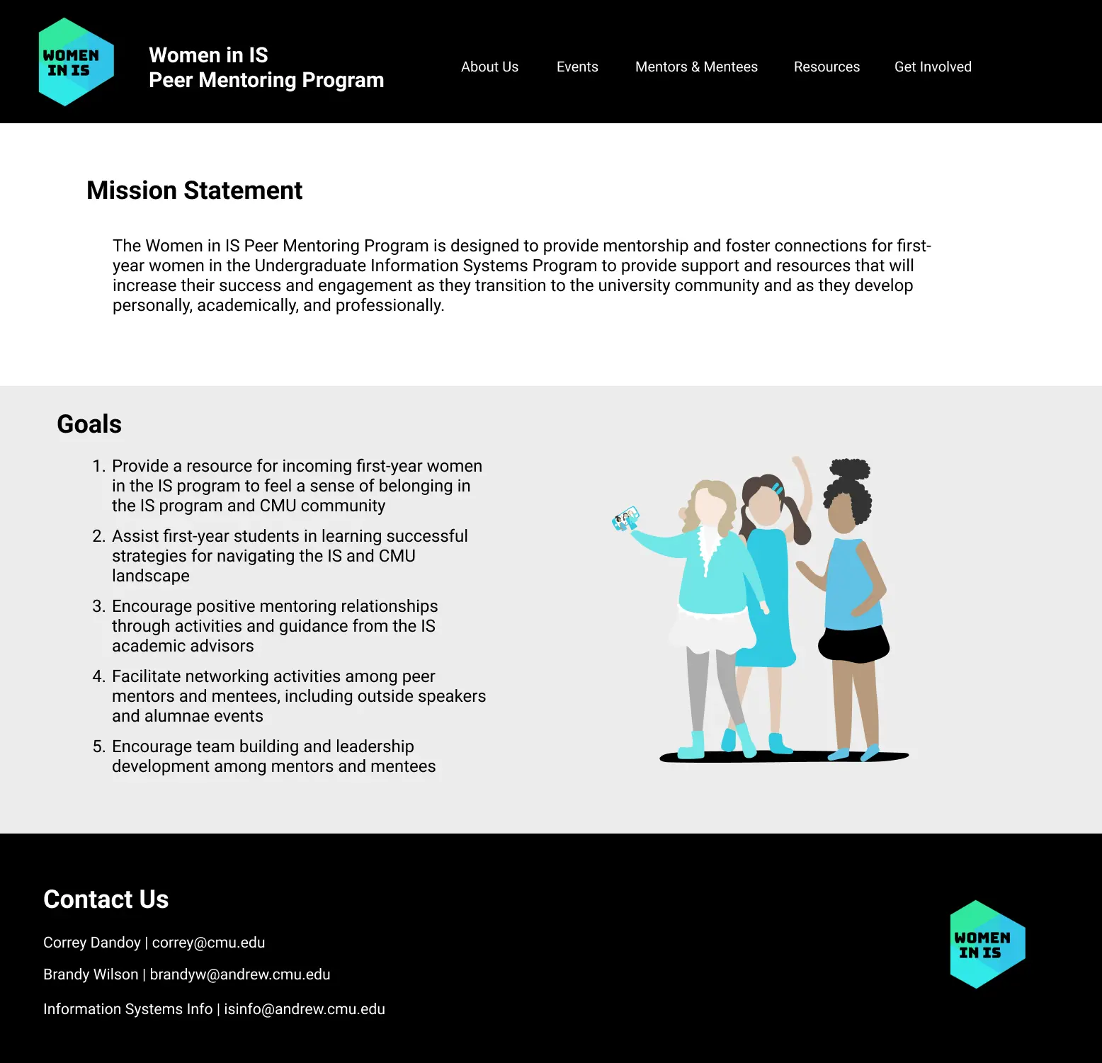
Combine and collapse the mission statement and general overview into one
Users were still confused on the timeline of the program and how to actually join the program
See Solution
Create an application timeline under the Get Involved page
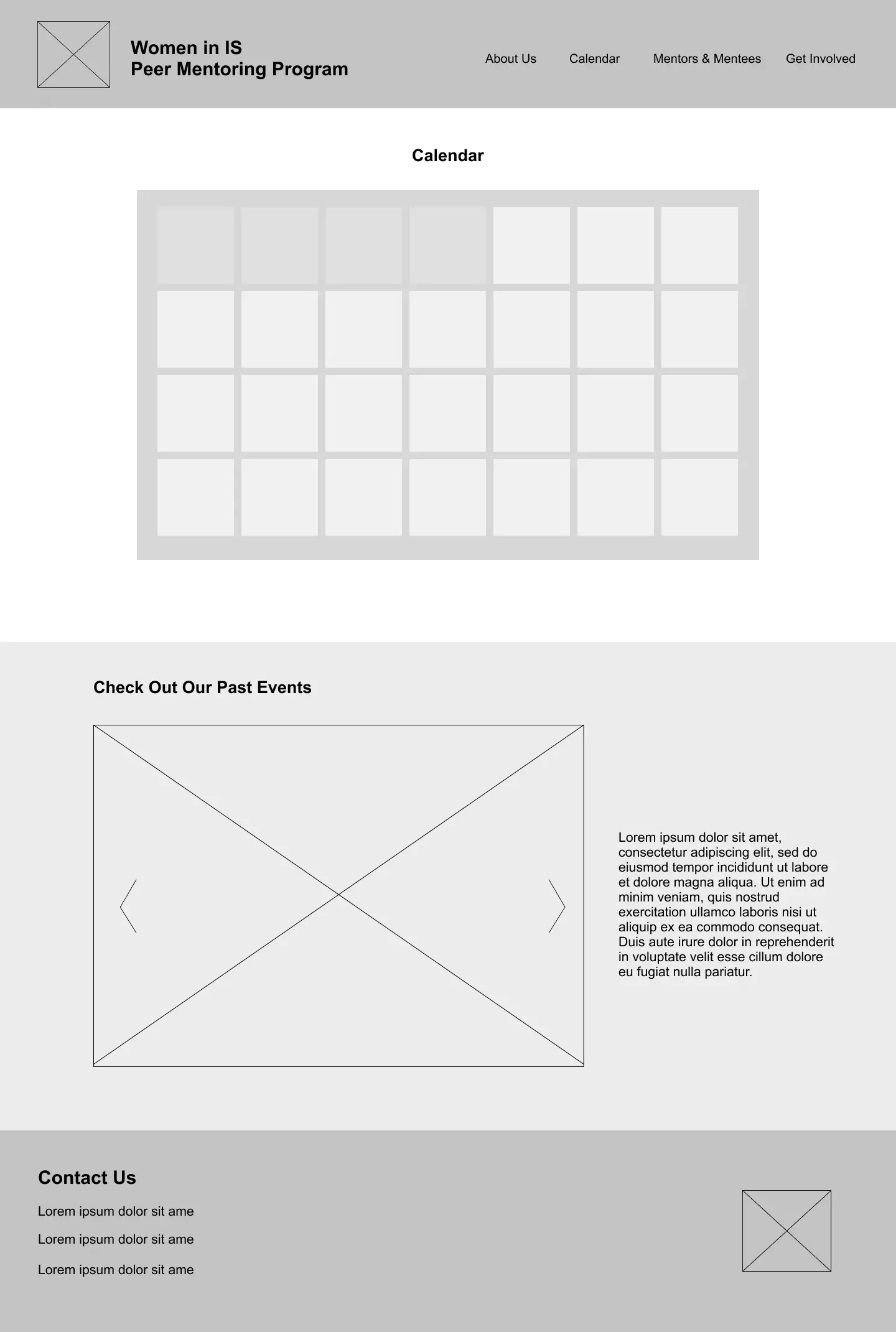
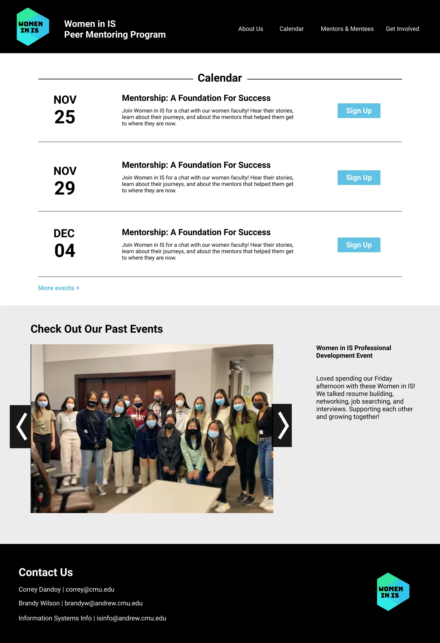
Client expressed concerns that the calendar would look empty if only one or two events were scheduled in a specific month
See Solution
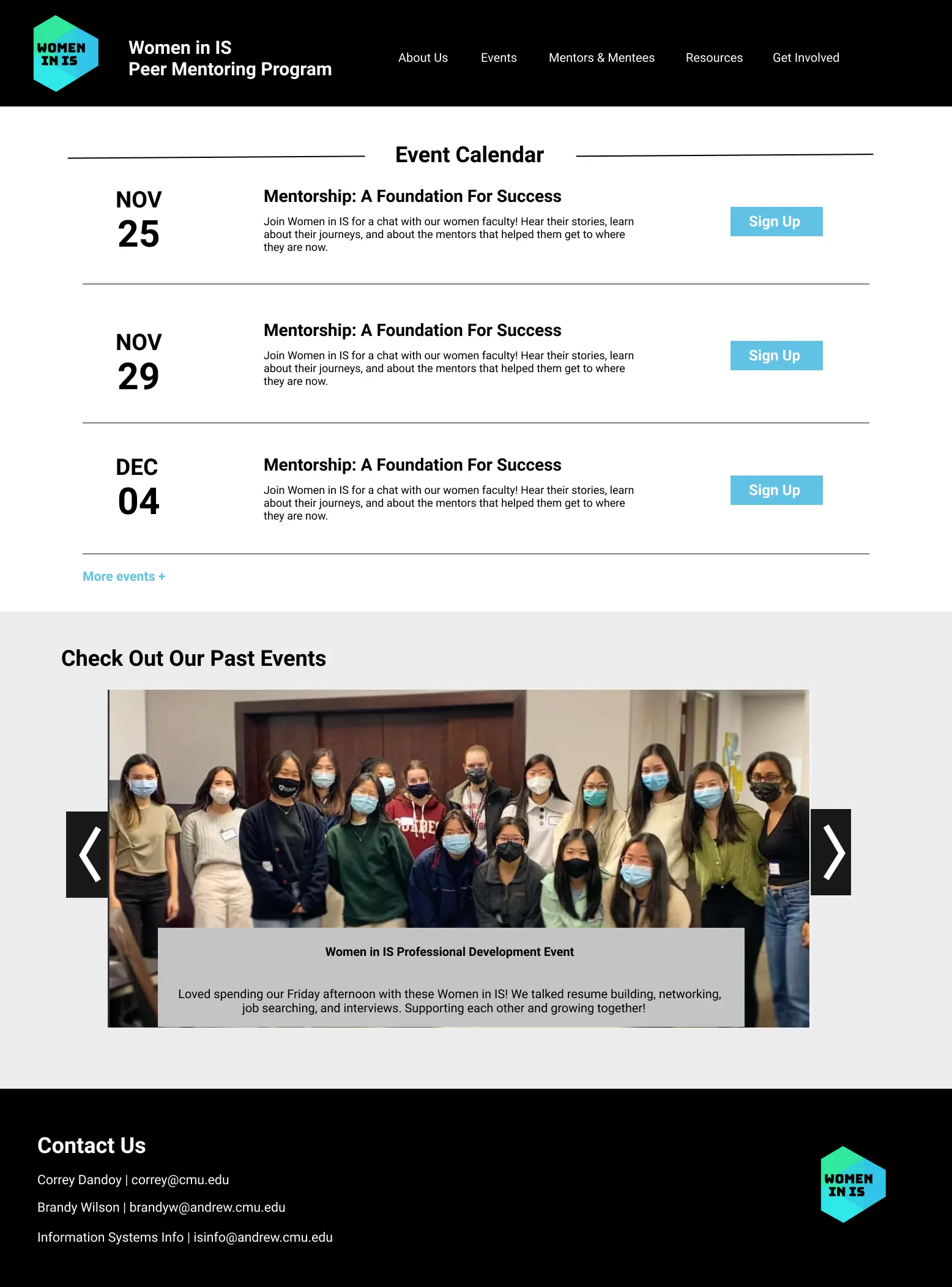
Adapt the grid calendar into a list of events instead
Feedback from testing was evaluated and adapted to incorporate changes, helping shape the design of our high fidelity wireframes.
Our first round of iteration reduced and condensed repetitive content, added new information to help interested members join the program, and transformed the visual layout of the Calendar.
Home
About
Calendar
Mentors & Mentees
Get Involved
After refining and iterating to create hi-fi wireframes, we conducted more testing with 3 new users (two current mentors, one current mentee) using similar interview procedure with open-ended general behavior questions and specific task-oriented scenarios.
While users liked the new event list format, the "Calendar" name of the page led them to expect an actual grid calendar
See Solution
Rename the Calendar page to "Events" instead
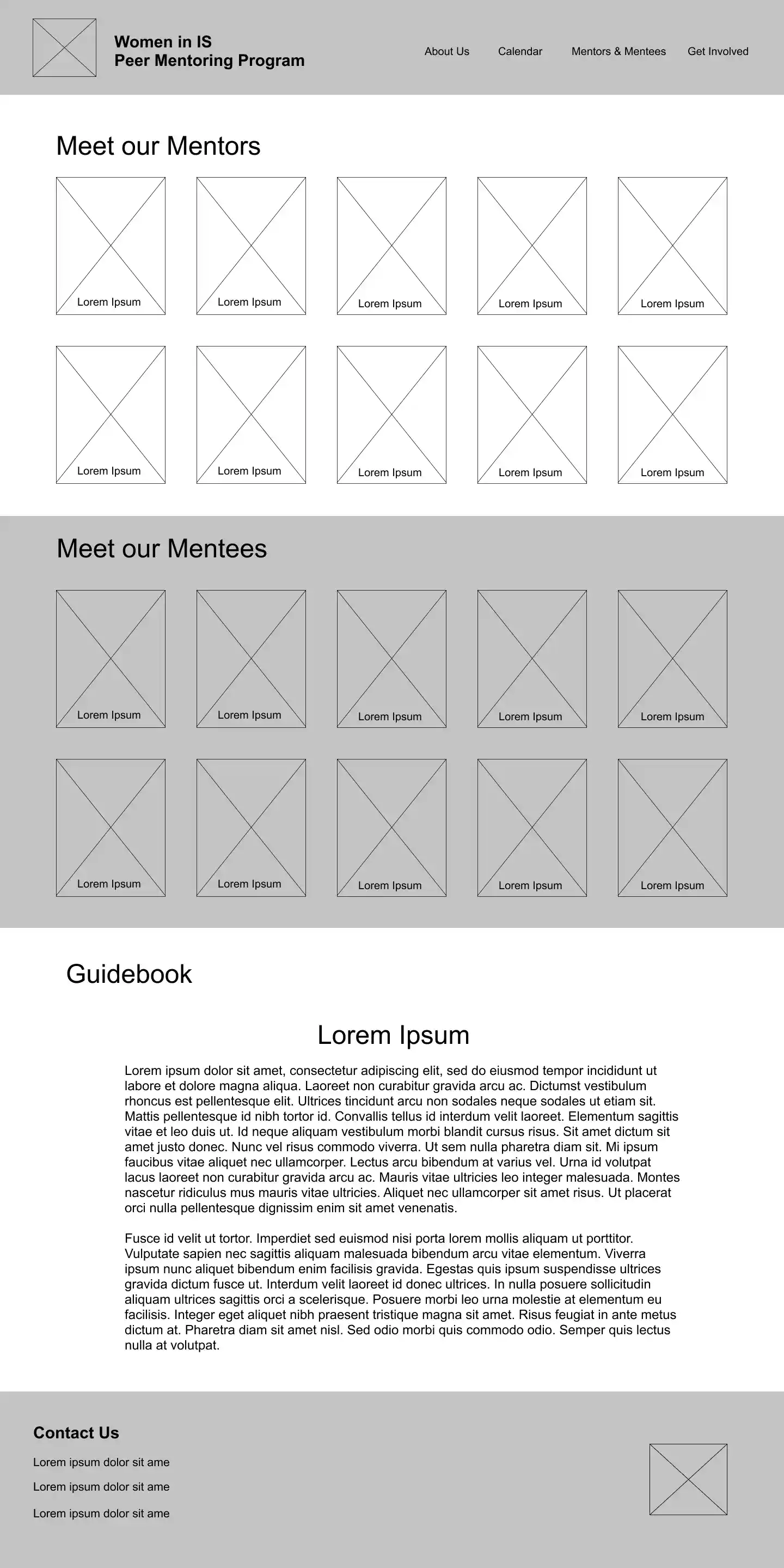
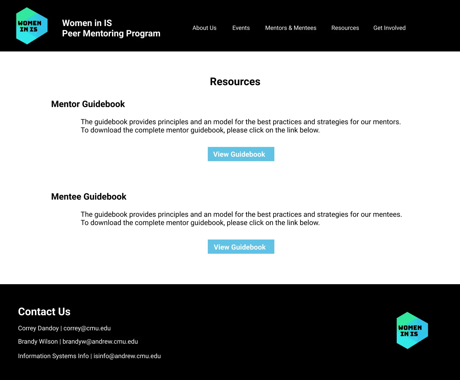
Users expressed they did not know mentor & mentee guidebooks existed and were less sure where to find them
See Solution
Seperate the Mentor & Mentees bios from guidebooks by creating a new "Resources" page
Users noted having the event description to the side of the Events carousel caused a disconnect between the text & photo
See Solution
Place the event description as a caption at the bottom of the carousel
Users wondered what the mentee requirements were after reading Mentor Requirements
See Solution
Add a paragraph for Mentee Requirements in complement to Mentor Requirements counterpart
This round of testing lead to several insights that helped set clearer expectations for the user of what to expect on pages and where to find information.
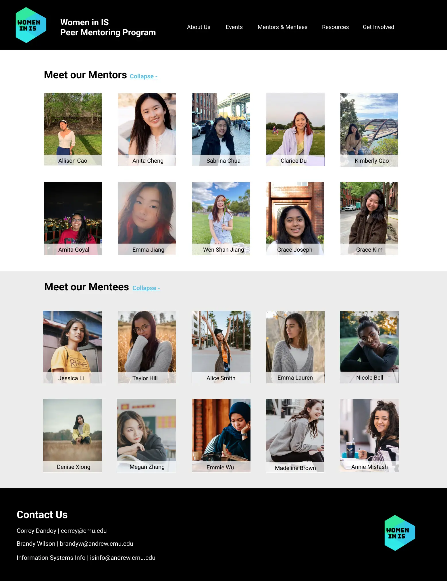
The most dramatic change resulted when all three users (as current Women in IS members) communicated that without knowing the guidebooks existed, they likely would not have known to locate them in the Mentors & Mentees page. To combat this, we seperated the guidebooks into their own page, allowing the user to more easily see that resources exist in the navigation.
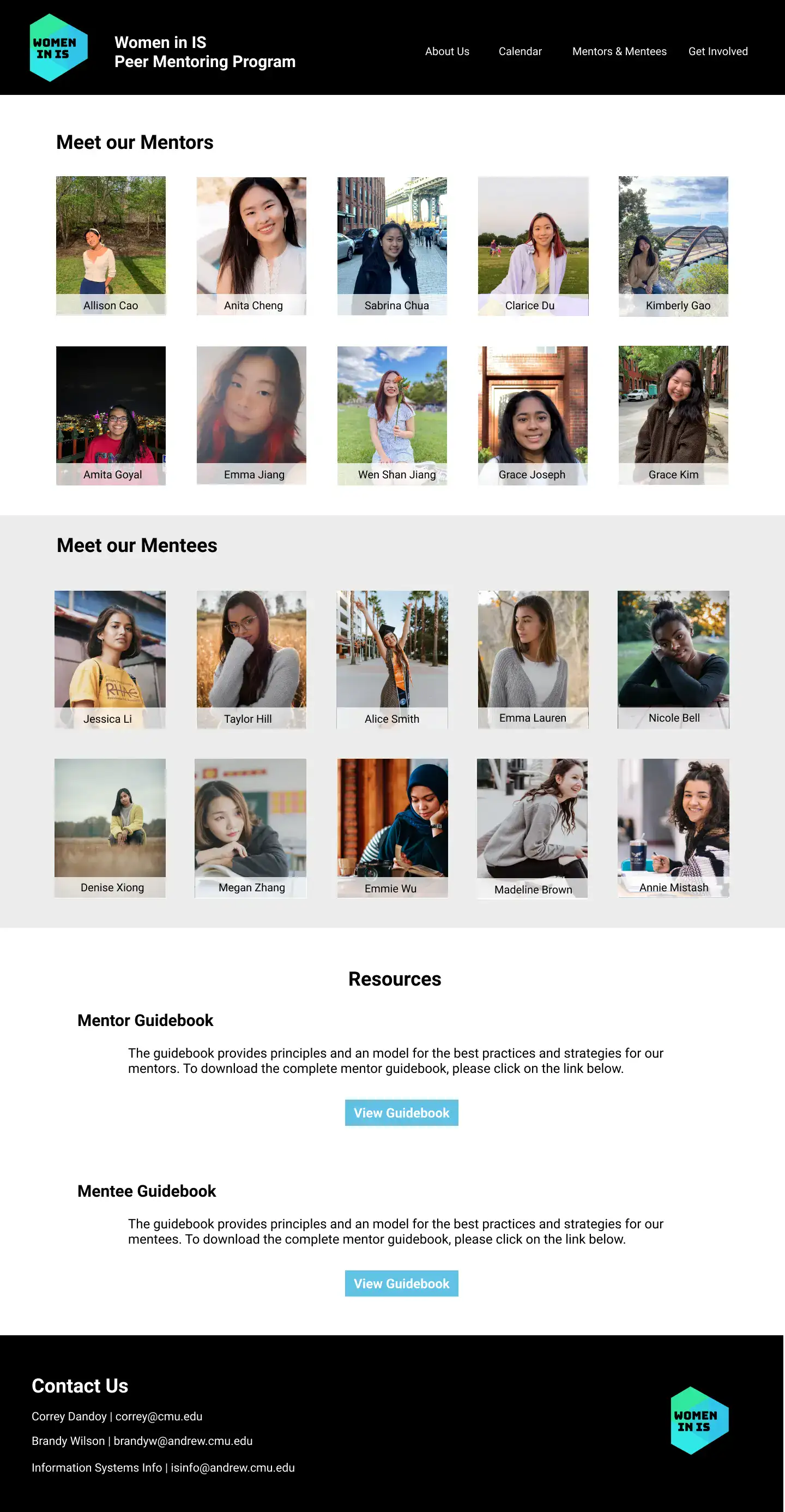
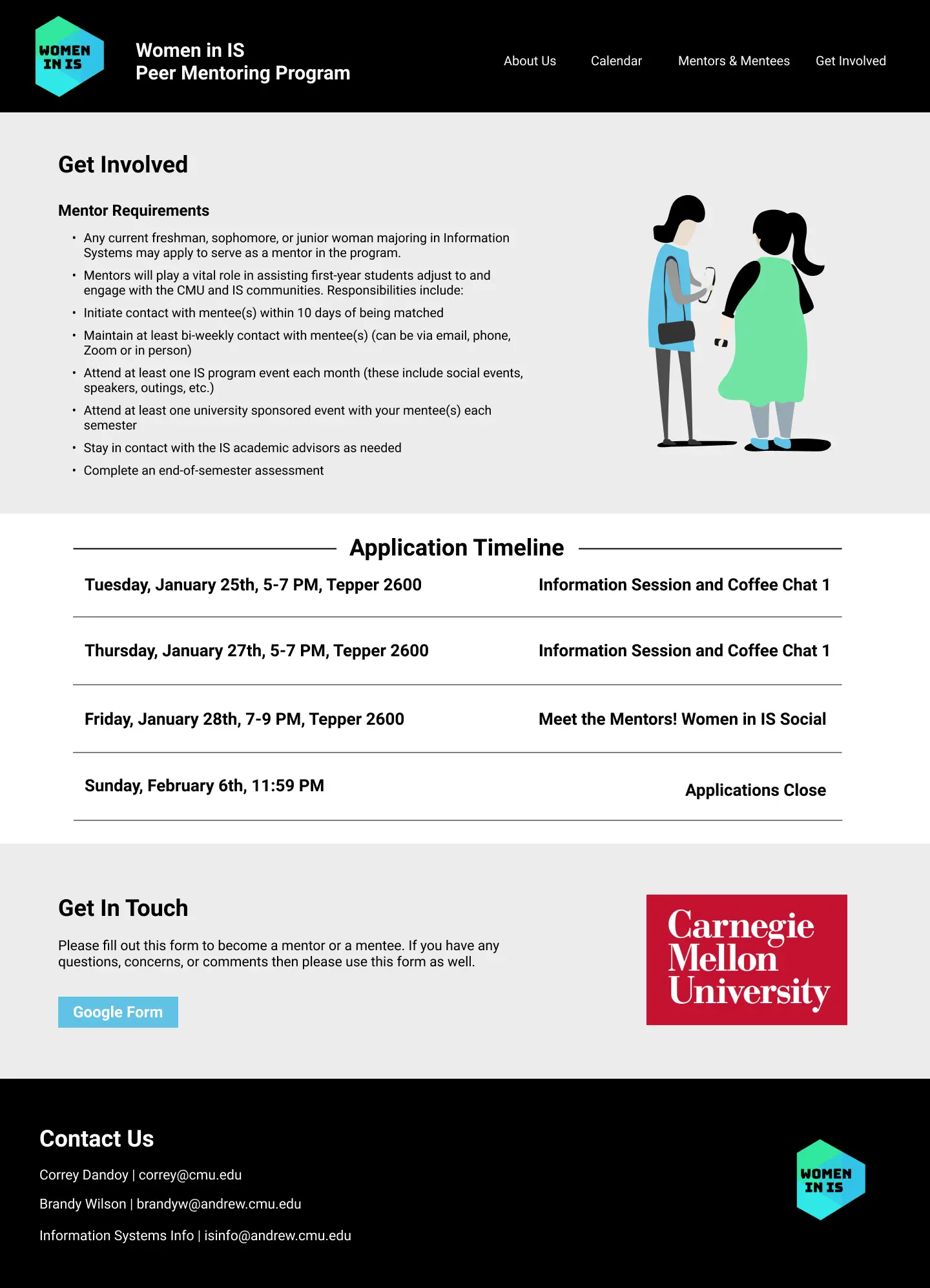
Home
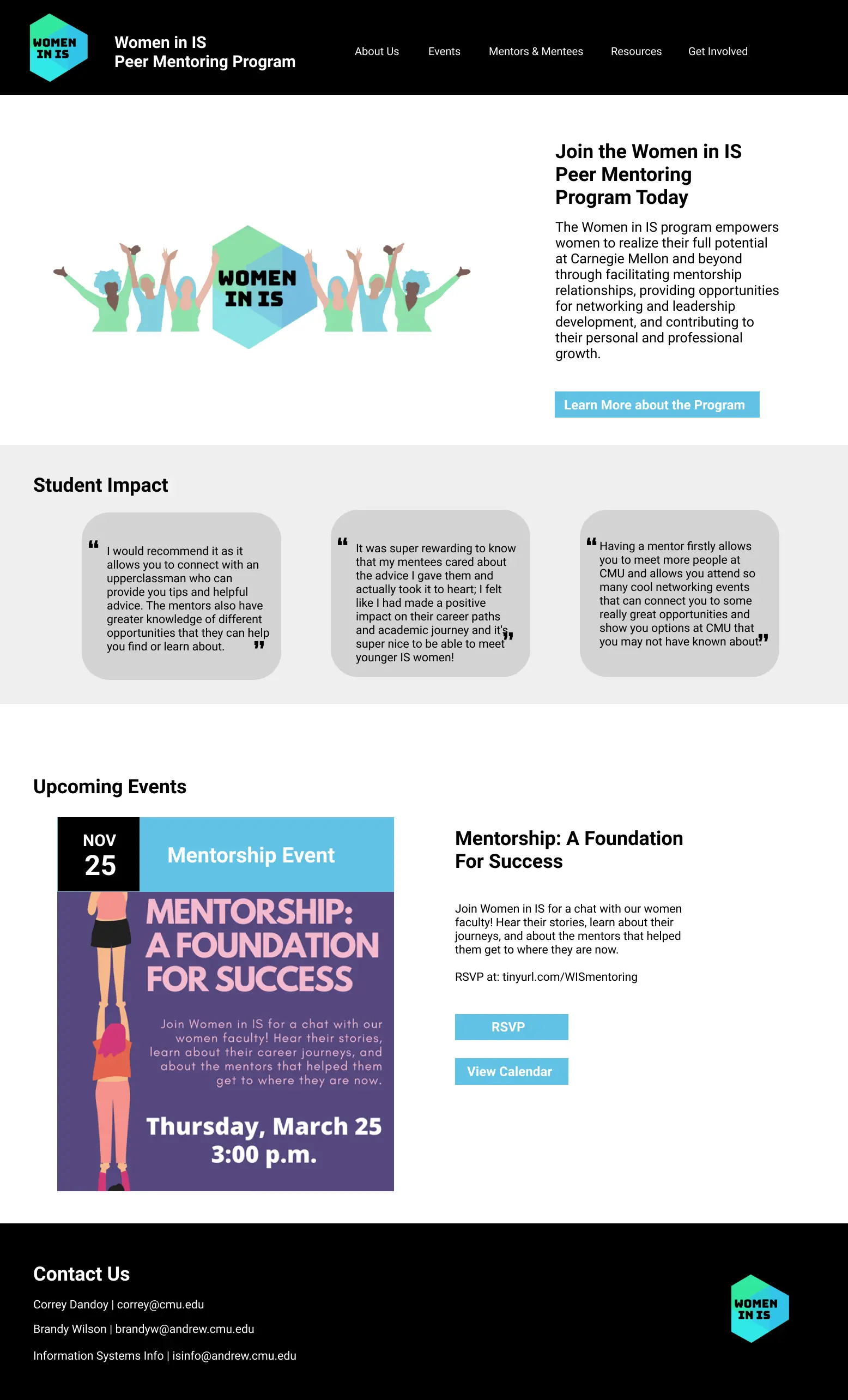
About
Events
Mentors & Mentees
Resources
Get Involved
The website prototype was coded using HTML, CSS, Javascript within a Boostrap framework. Due to time constraints, our team limted implementation to three high-content density pages: Home, Events, and Get Involved.