3 weeks
Photoshop, Canva, Figma
Research, Visual Direction & Design
Individual
3 weeks
Photoshop, Canva, Figma
Research, Visual Direction & Design
Individual
At the end of my 2021 summer internship with the Pittsburgh Learning Commons (PLC), I lead an evaluation of their current website in order to re-envision a new website that better reflected their values and work as a local non-profit that provides educational programs & resources for youth.
I identified three main challenges and areas of improvement that the new design would aim to tackle:
PLC closely works with the community and youth in Wilkinsburg. However, the existing website does not fully reflect this connection to & collaboration with youth-centered voices. Instead, the design caters more towards adults with a modern, but mature look.
The current website uses a template that results in a lack of customization and limited creative freedom in creating a design unique to the organization that distinguishes them from other programs.
Having recently adopted a new logo along with a new color palette, the organization struggled with maintaining consistent branding. The website offered an opportunity to feature and strengthen its branding.
By surveying community members and employees at PLC, I identified three primary audiences with different goals and motivations for engaging with the PLC website.
Find info on programs, community resources, etc.
Sign up for on programs
Find ways to show or sell their work
Learn about what PLC does
Become partners
Get resources (e.g lesson plans)
Learn about PLC's history and impact
Donate or get involved
View financial/annual reports
Recategorization was necessary to improve the navigational flow where new pages were created, old ones were discarded or merged with another.
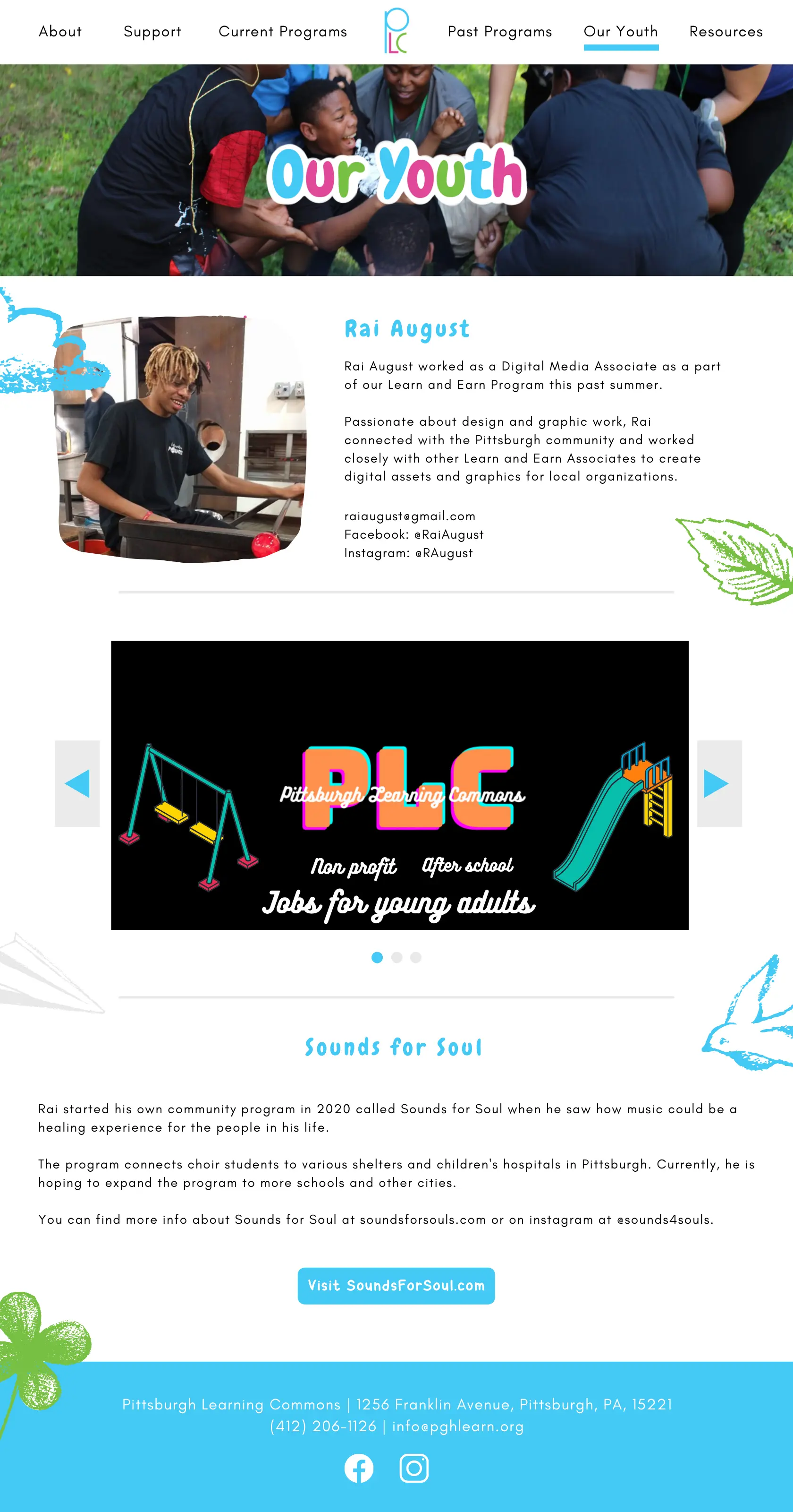
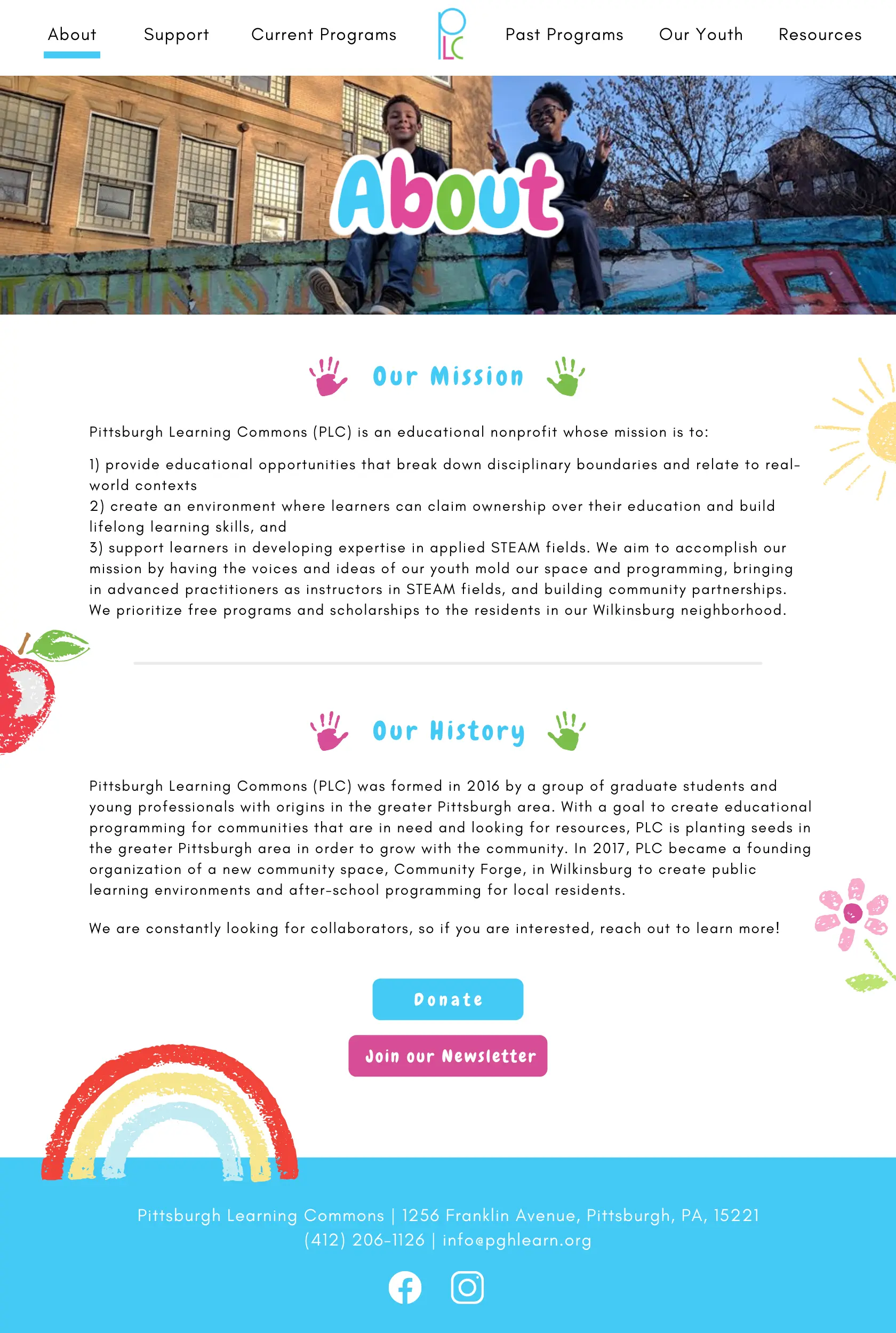
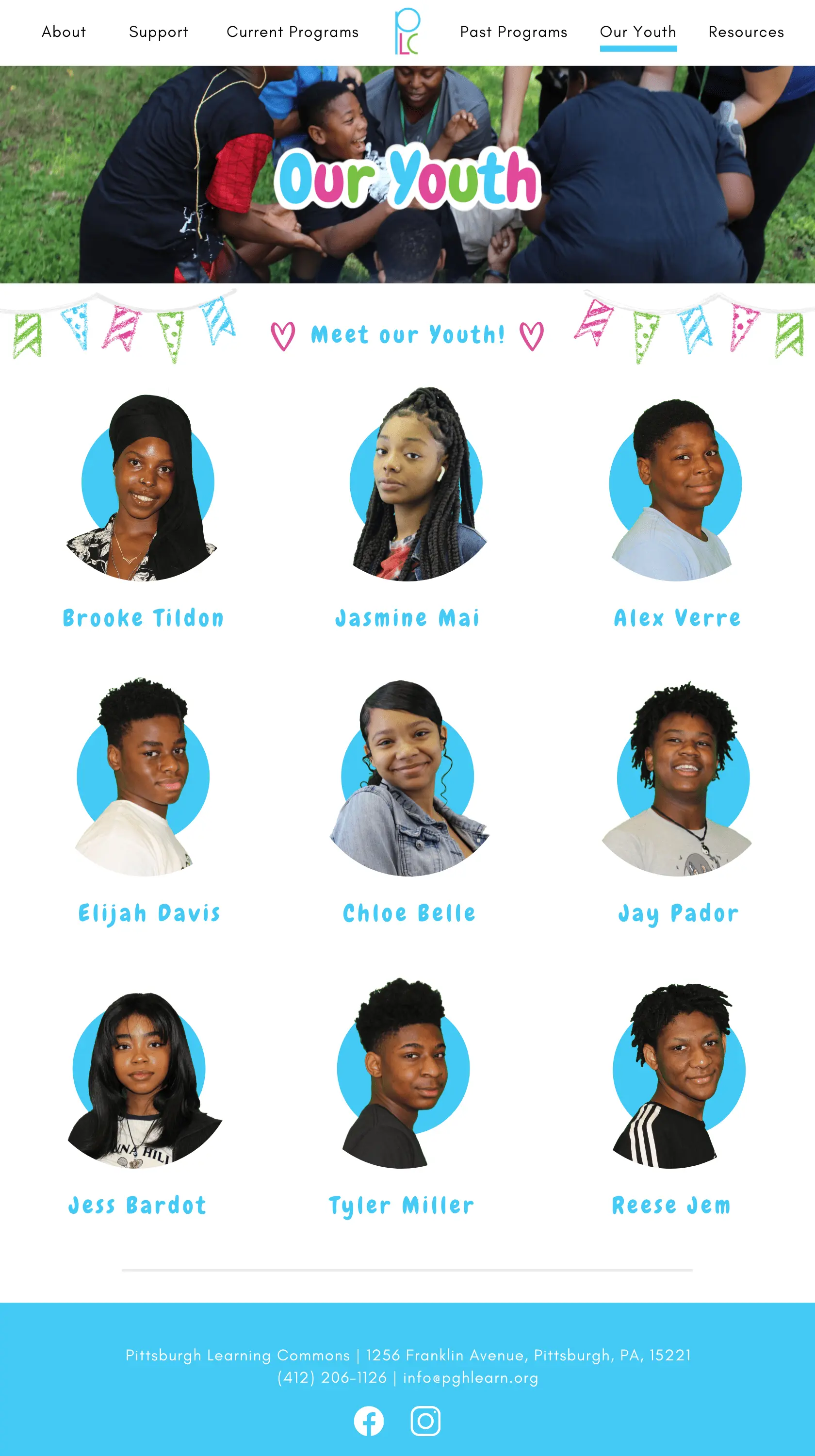
The primary focus of the project aimed to bring in a new visual direction for PLC and re-envision what their new website could look like. In moving away from the mature design of the existing website and prioritizing a more youth-driven voice, I made the following recommendations:
Choose a handwritten, organic bubble-letter font instead of the rigid bold fonts
Incorporate chalk drawings as background graphics to reinforce PLC's values of youth creativity & expression
Adopt a wider use of PLC's colors (including headings & graphics) to help strengthen branding and make the design more vibrant
PLC has a large photo archive that could be highlighted to show its engagement and history with the youth & community
While PLC's existing website had been created through a Squarespace template, I recommended the organization move to a different website-hosting platform than Squarespace in order to address the identified challenges and implement the recommended changes. Squarespace's templates are rather restrictive in terms of where users can place content and are not ideal for customization.
In contrast, Wix could be a good option for PLC to transition to a new webiste. Wix offers much more customization and creative freedom, which would be crucial in the case of incorporating and controlling the layout of chalk graphics.
Integrating the research & recommendations, I created these mockups to help visualize what the new website could look like:
About
Our Youth
Youth Spotlight